
Overview
During my 10 weeks UX internship at Foodstuffs, I worked on streamlining the Delivery Practice Refresh (DPR) reporting process, an internal system used to monitor delivery performance maturity across multiple departments and squads.
The existing process relied on manual updates in Miro and fragmented reporting, making it difficult for stakeholders to gain a clear, consistent understanding of project health.
My role involved understanding the existing workflow, conducting user research, identifying pain points, designing dashboard concepts, validating them with users, and iterating based on research findings.
My Role
Stakeholder collaboration
Workshop observation
User interviews
Research synthesis
Wireframing
Usability testing
Design iteration
Tools
Figma • Power BI • Miro • Jira
The Challenge
Foodstuffs had introduced the Delivery Practice Refresh (DPR) framework to measure delivery maturity across teams.
However, the reporting process was highly manual.
Teams updated Miro boards manually, information was spread across multiple sources, and different stakeholders interpreted the data differently.
As a result:
Teams spent significant time maintaining reports.
Decision-makers lacked a single, reliable view of project maturity.
Information was difficult to compare across departments.
Different users required different levels of detail.
Problem Statement
How might we transform a fragmented, manual reporting process into an intuitive dashboard that gives stakeholders a clear view of delivery maturity while supporting faster, evidence-based decision-making?
Understanding the current ecosystem
One of the first challenges was understanding the DPR framework itself.
It was completely new to me.
Although I had an introductory discussion with the Product Owner, I was curious to understand how the process worked in practice.
Rather than making assumptions, I asked to attend one of the delivery workshops.
Observing the process first-hand allowed me to understand:
how teams completed assessments
how delivery maturity was measured
how information moved between squads
where users experienced friction
During the workshop I documented observations, questions and early assumptions that I later validated through user research.
Research Approach
Before interviewing users, I aligned my observations with the Product Owner to ensure I understood the business context correctly.
Since this was an internal system with direct access to users, I selected qualitative interviews as the primary research method.
My objective wasn't simply to validate a dashboard—it was to understand how different people used delivery information to make decisions.
To capture diverse perspectives, I recruited participants across multiple roles, from operational teams through to leadership.
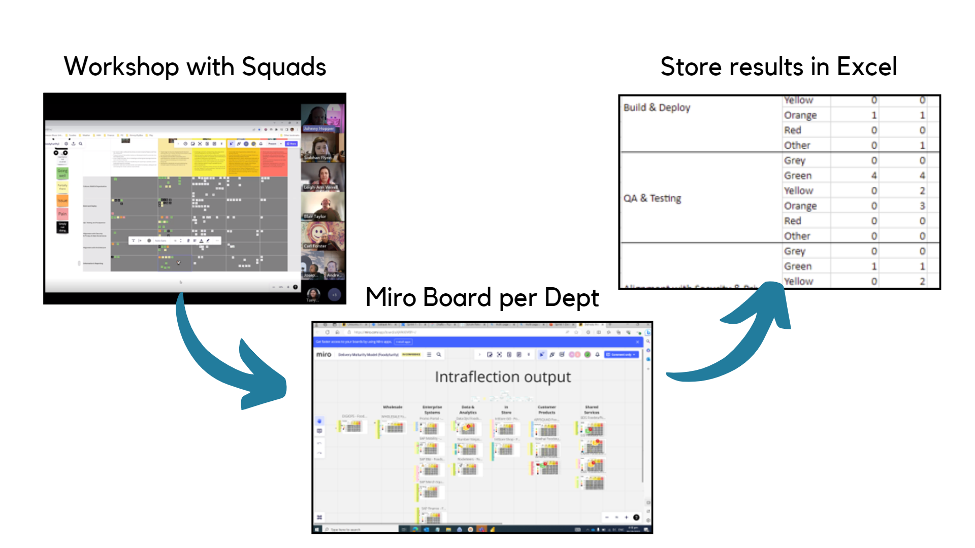
Virtual workshop on teams, updating the notes on Miroboard and storing results on excel.
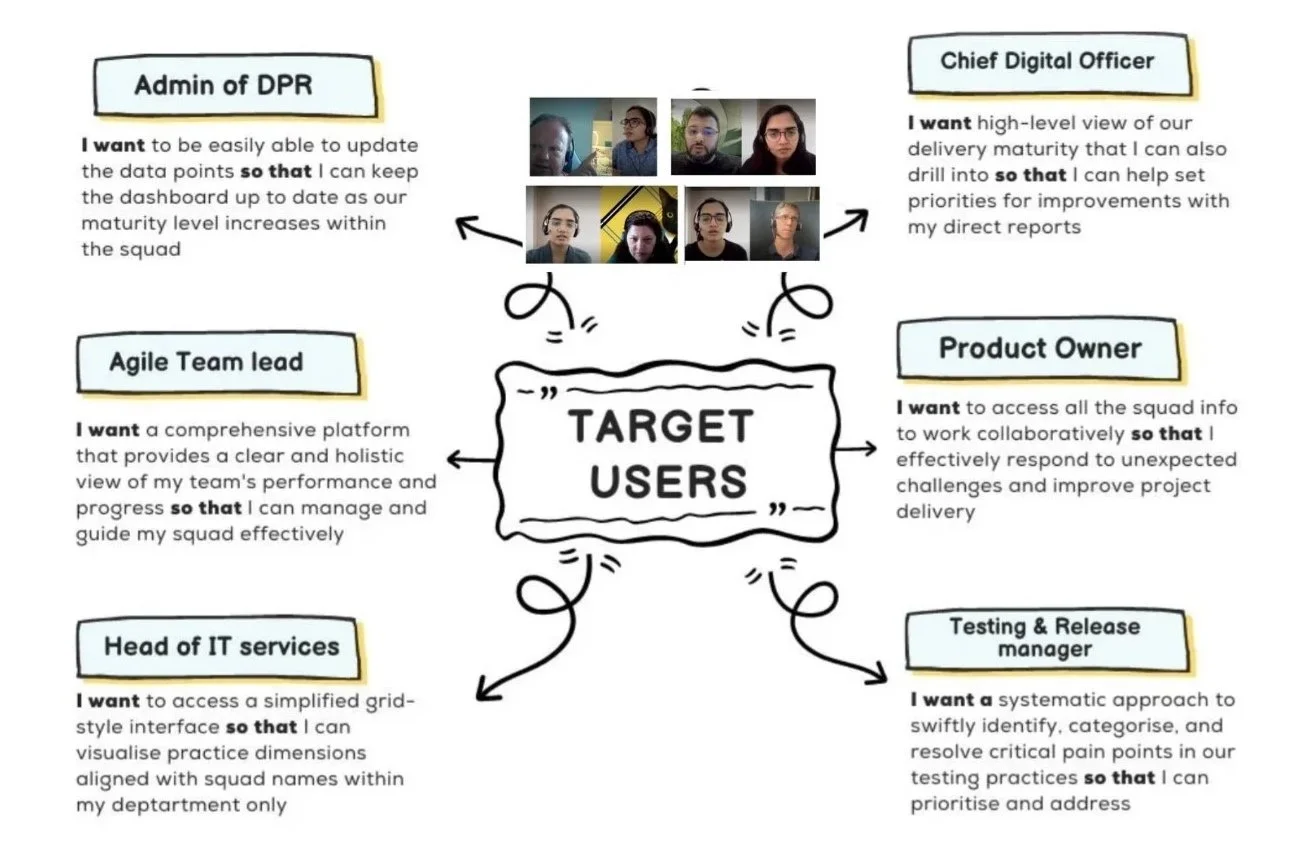
Key User Stories
Key Research Insights
Different stakeholders needed different information
Operational users focused on day-to-day delivery activities, while leadership wanted higher-level maturity insights.
A single static report could not effectively serve everyone.
Manual reporting created unnecessary effort
Updating Miro boards required repetitive manual work and often resulted in inconsistent information.
Fragmented information slowed decision-making
Users had to move between multiple reports and tools to understand overall project health, making it difficult to identify priorities quickly.
Opportunity
These findings shifted my thinking.
Rather than simply replacing Miro with another report, the opportunity became designing a dashboard that supported decision-making by bringing the right information together in one place.
From Research to Design
Based on the findings, I explored low-fidelity concepts focused on:
reducing cognitive effort
improving information hierarchy
surfacing key metrics first
supporting quick scanning
simplifying navigation
The concepts were reviewed collaboratively with the project team before moving into implementation.
Designing in Power BI
Initially I expected the solution to be built entirely in Figma.
However, the project team decided the working solution would be developed directly in Power BI to integrate with the organisation's reporting environment.
Power BI was new to me.
Looking back, it became one of the most valuable learning experiences of the project.
It reinforced that good user experience is independent of the tool being used.
Whether designing in Figma or Power BI, the principles remained the same:
understand users
reduce friction
support decision-making
iterate using feedback
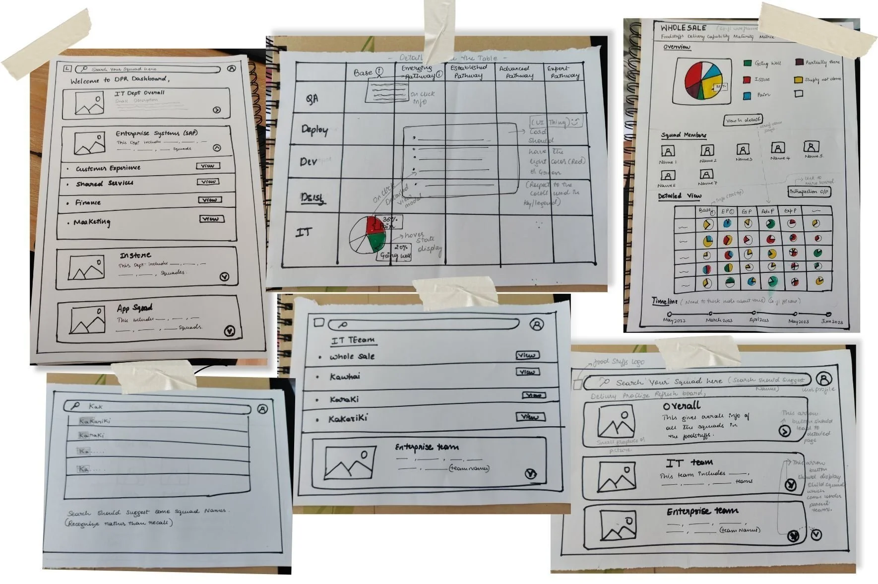
Initial lo-fi design ideations for the reports and the dashboard landing page
Testing small elements from lo-fi sketches on PowerBI platform
Alpha Release
We launched an alpha version containing four reports for a targeted group of users.
To gather broad feedback, the prototype was shared across the department through a structured feedback process.
The feedback highlighted several usability concerns, particularly around navigation and information retrieval.
Instead of treating this as a setback, I viewed it as an opportunity to learn more about how users interacted with the dashboard.
I developed four new reports on PowerBI. Utilising Figma for preliminary design sketches and employing design thinking principles, Our goal for the alpha release is to prioritise 80% functionality and usability, with 20% focus on the visual interface, to evaluate its effectiveness for users.

Quantitative user testing feedbacks on Alpha release
#1 Usability Challenge: Ineffective Scrolling Report
Usability was problematic as the scrolling report proved ineffective; the user struggled to recall and recognise information after applying the filters.
#2 Performance Impact: Slower Speed
Overall performance and refresh speed were slightly slower in PowerBI due to the enabled interaction buttons.
Iteration
Based on these findings, I redesigned the dashboard by:
Removing long scrolling pages
Presenting key reports within a single primary view
Simplifying Power BI interactions
Improving visual hierarchy
Grouping related information using proximity principles
Adding clear legends and report descriptions
These changes reduced cognitive effort and made information easier to locate and interpret.
Users feedback on Beta release
I conducted quantitative user testing by sharing the PowerBI link across the Foodies IT department to assess users' feelings about the beta release reports and gather feedback.

Quantitative user testing feedbacks on Beta release
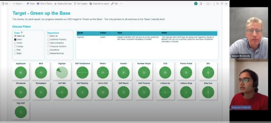
User Testing with Foodstuffs CDO - Simon Kennady
Final DPR dashboard release
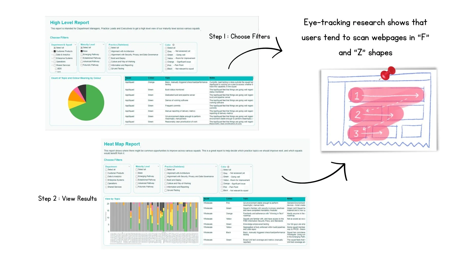
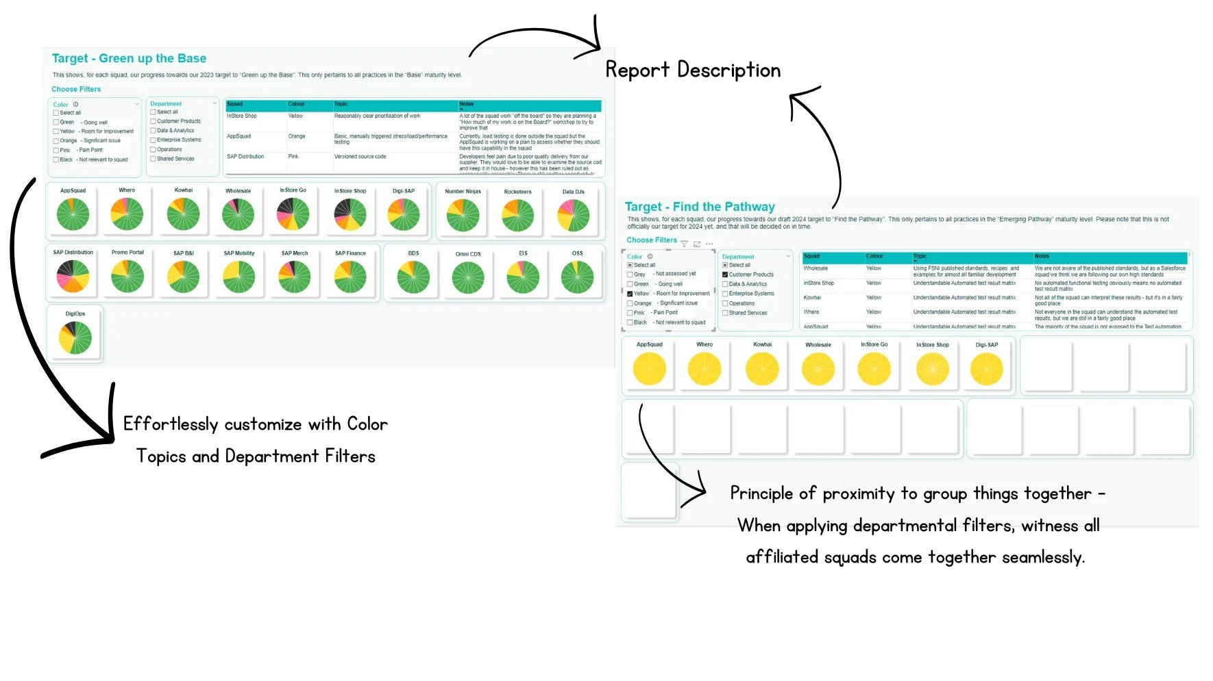
The UI of the site uses Foodstuffs signature aqua teal as the primary theme color. We also develop different theme colors for pie charts. Below is the final visual design of a few main pages, the original data was modified for confidentiality reasons.
To enhance user experience, take into account the common eye-scanning patterns observed on web pages. For individuals who read from left to right (LTR) languages, these patterns typically follow the F and Z shapes.
The F pattern indicates that users are inclined to start by focusing on the top-left corner before scanning horizontally. Subsequently, they zigzag down the page, following a Z pattern, once again moving from left to right to navigate through subsequent sections or rows.
We also addressed the beta release feedback before releasing it to the Foodstuffs IT department. We grouped the pie charts by department using the principle of proximity and added a legend for the color keys next to the charts.

Takeaways
This project fundamentally changed the way I think about design.
At the beginning, I believed the challenge was designing a dashboard.
By the end, I realised the real challenge was understanding how people make decisions.
Research taught me that assumptions should always be validated, user behaviour often reveals problems that users don't explicitly describe, and iteration is an essential part of creating meaningful experiences.
Perhaps my biggest takeaway was learning that great user experience isn't defined by the design tool—it comes from understanding users, testing ideas, and continuously improving based on evidence.